The problem
On election night, the entire newsroom is working. One reporter is covering schools, another is covering city hall, a photographer is visiting polling locations, and our bilingual editor is writing Spanish-language versions for the free news website, El Sol de Yakima.
By the end of the night the newsroom had produced articles in two languages and a photo gallery within a few hours, feeding an audience that also demands candidate profiles, external widgets, and related prior reporting. The same structural pressure shows up during state basketball tournaments, breaking news, and any story big enough to generate a sustained stream of content. When the newsroom produces the work, our website must display it in a way that rewards the readers who show up.
That pressure has only grown. As AI-generated answers replace search results and social platforms deprioritize external links, the referral traffic that regional newsrooms once relied on is eroding. The readers who come directly to your site because they trust you are the ones you can actually keep. The on-site experience has to meet their expectations for what a news site should look and feel like.
Previous colleagues had built a set of topic landing pages connected by a trending topics bar, and that system worked for years. But the bar was static and hard-coded — there was no indication of which page you were on, and no way to tell readers a section had been recently updated. Content cards rendered the same regardless of asset type. There was no native mobile sharing. And editors had no way to organize mixed content on a single page without each collection taking up too much vertical space.

Two audiences, one system
Every decision in this project had to serve two groups simultaneously.
Readers need freshness signals — a way to tell what’s new, what’s developing, and what’s worth their time. They scan. They check the site on their phone between other things. If the page looks the same as yesterday, they leave. They don’t care about the CMS; they care about whether the site respects their attention.
Editors need tools that don’t add steps. They’re filing stories, managing photographers, coordinating bilingual coverage, and publishing under deadline pressure. If a tool requires them to think about the website’s presentation while they’re producing the journalism, that tool has failed. The system has to work when editors aren’t thinking about it.
The constraints
Yakima Herald-Republic runs on BLOX TNCMS, a content management system built for regional news organizations. It gives you a lot out of the box, including asset collections, a component framework, a templating language (UTL), and a search API. Regional newsrooms don’t have the luxury of dedicated product teams — there’s no designer, no UX researcher, no frontend engineering team. Everything I built had to extend the platform, not replace it: vanilla JavaScript and CSS written into custom blocks and macros, no server-side logic beyond what UTL provides, and no changes to the CMS itself.
Content decisions
The system is three pieces: a trending topics bar that surfaces content freshness, a set of content cards with type-aware display logic, and a client-side filtering engine that lets editors organize content views without building separate pages. But before any of that could work, the content language had to be right.
Choosing “trending”
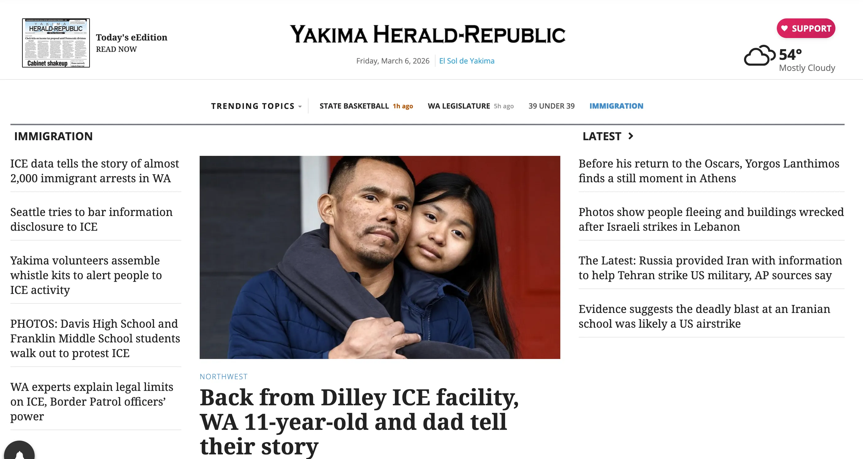
The word “trending” was chosen deliberately. News websites can feel static or outdated without some signal that the organization is paying attention. “Trending” implies the newsroom is listening — to the community, to the news cycle — and staying current. Each label is specific to the landing page it points to rather than a generic category name, which keeps the bar grounded in actual content rather than site architecture.
Not every item in the bar is there because it’s breaking news. Special sections — highlighting young professionals in the community, for example — sit alongside active news topics because the bar is also a visibility tool. A section that hasn’t published in three days can still earn a permanent spot if it serves readers who come looking for it. The system accounts for both active and evergreen coverage. In practice, one or two items in the bar will carry a freshness badge at any given time. The rest are stable navigation.
The labeling constraint
The trending bar is curated daily by editorial staff. Editors choose which topics appear, in what order, and what each item is called. The freshness indicators are automatic — the first four items in the bar are eligible to receive them — but the content those indicators attach to is a human decision.
Editors already know how to write for their audience. The only thing they can’t see from inside the CMS is how their label will render in the bar. So the guidance I wrote is a single constraint: keep labels under twenty characters. Everything else is editorial judgment.
That’s it. One rule. Not a style guide, not a checklist — just the one thing they couldn’t verify on their own.
Freshness language
Timestamps follow a deliberate hierarchy. “Today” and “Yesterday” display in amber to signal active coverage. Older dates fade to grey. The color distinction is the content decision — it tells readers at a glance whether this section is alive right now or archival. The trending bar uses the same logic: a freshness badge reading “12m ago” or “3h ago” appears only when content is recent enough to warrant the signal.
Type-aware labeling
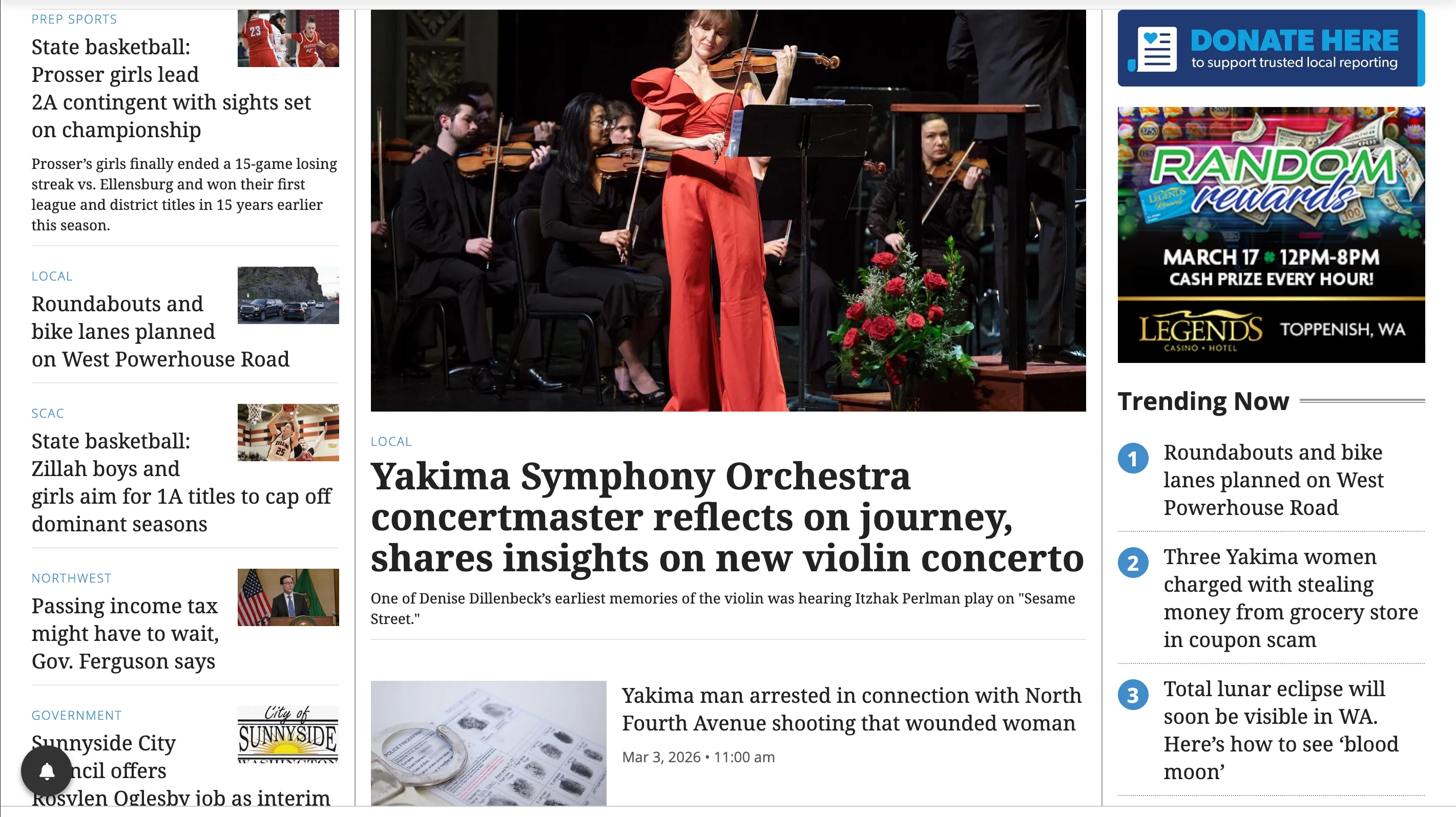
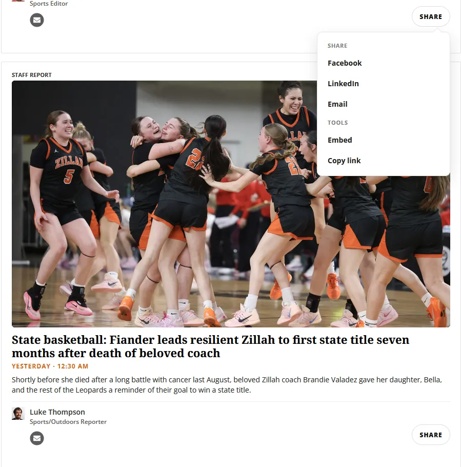
Content cards carry badges that tell readers what they’re looking at before they click. A photo collection renders with a “Photo Gallery” badge. A link to El Sol de Yakima carries an “El Sol de Yakima” badge. A bylined article shows “Staff Report.” The labels aren’t decorative — they set expectations for the experience behind the click.

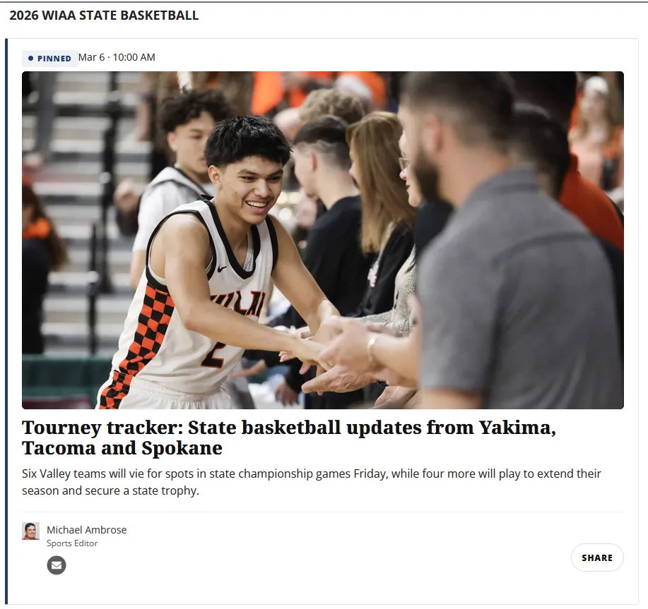
Pinning as a familiar pattern
The pinned card uses subtle styling differences to signal hierarchy without requiring explanation. Editors already understand pinning from social media. Applying that same pattern here gives them a familiar tool for setting the editorial tone of a landing page and driving first-visit traffic to evergreen content.
How it works together
Consider the state basketball tournament, March 2026. The newsroom is filing articles, photo galleries, and live updates across multiple days.
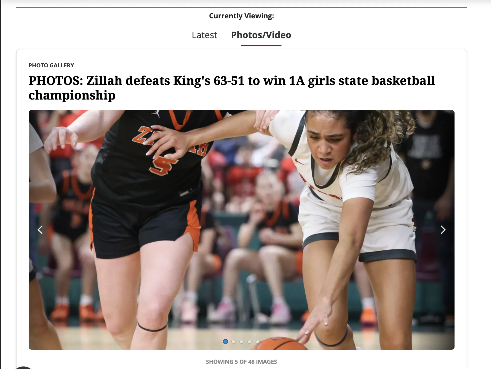
Here’s what the reader sees: the trending bar shows “STATE BASKETBALL” with an indicator dot and a “12m ago” freshness badge. They click through to the topic page, where filter tabs split the feed into “Latest” and “Photos/Video.” The latest tab shows a pinned preview article at the top setting the tournament context, with staff reports and El Sol links below it. The photos tab surfaces collection cards, each previewing images in a carousel. Every card carries a “Today” timestamp in amber.
The filtering system adds client-side tabs that let editors split content into views without building separate pages or duplicating blocks in the CMS.
The system handles several newsroom focuses at once. The trending bar can surface multiple topics, each with its own freshness indicator. The content cards display any asset type. The filtering engine organizes them into any number of views. With the system in place, the newsroom focuses on producing content and the tools handle the presentation.
You can see the system live at yakimaherald.com/basketball.
Teaching the system and iterating with editors
Building the tools is half the job. The other half is figuring out what editors actually need from you.
I made concise walkthroughs showing editors how to pin a post, add a new collection, or set up a filter, placed directly in the CMS where they’d be found at the moment of need. A short video covered the trending bar configuration for editors who learn better by watching than reading.
The system improved through use. The photo editor noted that without a counter, the carousel would look like each collection only had five images attached — so we added one. The bilingual editor surfaced an edge case where El Sol link assets rendered without the external-link indicator when the URL format didn’t match the defined pattern. Finding that required someone using the tool in a context I hadn’t anticipated. Fixing it took ten minutes.
The current implementation requires editors to lightly edit markup to configure the bar. The next iteration will apply the same freshness logic to collection assets directly, removing that friction for non-technical staff entirely.
The impact
Regional newsrooms don’t have the luxury of dedicated product teams. Editors are filing, photographers are shooting, and the website has to keep up on its own. The trending bar, the content cards, the filtering engine — the system works when editors aren’t thinking about it. A reporter on deadline shouldn’t have to consider how their story fits into the page flow. That problem should already be solved.
The redesigned help articles and onboarding documentation built alongside these tools contributed to a 35% reduction in customer-service calls — readers could find what they needed without calling in. The top-of-funnel user journey work, including the landing page redesigns and freshness signals that made the site feel current, contributed to 25% year-over-year newsletter subscriber growth.
What the system actually does is create space. Editors focus on the content. The tools handle the presentation. And readers — habitual ones especially — get a site that rewards their attention: something new to find, a clear signal of what’s been updated, a feed that expands their curiosity rather than just confirming what they already knew they wanted.
That’s harder to build than it sounds. A site that feels cohesive and trustworthy isn’t the result of a single design decision — it’s the accumulation of a lot of small ones, made consistently in the same direction. The freshness indicators earn trust by being honest about when something is new and when it isn’t. The filtering tabs earn trust by not burying content. The pinned card earns trust by giving readers context before they need to ask for it.
Technical implementation
The three components share a design philosophy: vanilla JS, no dependencies, class-based hooks on existing BLOX blocks, and ARIA accessibility throughout. The code below is for readers who want to see how the system works under the hood.
Trending bar — freshness polling
TNCMS exposes an editorial search endpoint that returns asset data as JSON. The trending bar polls this endpoint client-side to check whether a topic section has fresh content and surfaces a timestamp if the content is recent enough.
// Polls the TNCMS search API for the latest content on a topic
// and injects a timestamp into the trending bar if recent enough.
function checkTopic(topic) {
  const cacheKey = topic.hrefPrefix;

  const cached = cacheGet(cacheKey);
  if (cached !== null) {
    if (cached.iso) {
      const chip = findChip(topic.hrefPrefix);
      if (chip) injectBadge(chip, cached.iso);
    }
    return;
  }

  fetch(topic.searchUrl)
    .then((res) => {
      if (!res.ok) throw new Error(res.status);
      return res.json();
    })
    .then((data) => {
      if (!data.rows || !data.rows.length) {
        cacheSet(cacheKey, { iso: null });
        return;
      }

      const asset = data.rows[0];
      const timeObj = topic.useUpdated
        ? asset.lastupdated || asset.starttime
        : asset.starttime || asset.lastupdated;

      const iso = timeObj && timeObj.iso8601;
      if (!iso) {
        cacheSet(cacheKey, { iso: null });
        return;
      }

      cacheSet(cacheKey, { iso: iso, title: asset.title, url: asset.url });

      const chip = findChip(topic.hrefPrefix);
      if (chip) injectBadge(chip, iso);
    })
    .catch(() => {});
}
Content cards — type-aware display logic
The card template uses TNCMS’s UTL language to branch on asset type and render the appropriate badge and layout:
[% if oAsset.type == 'collection'; %]
  <span class="staff-badge">Photo Gallery</span>
[% elseif oAsset.type == 'link'; %]
  <span class="staff-badge">El Sol de Yakima</span>
[% elseif hasAuthors; %]
  <span class="staff-badge">Staff Report</span>
[% end; %]
Filtering engine — client-side content organization
A button group toggles visibility on panels using class hooks that wrap existing BLOX blocks. No content is fetched or destroyed — everything is in the DOM on page load, and the tabs just show and hide it.
// Client-side filtering engine for content panels.
function showOnly(key) {
  KEYS.forEach(function (k) {
    document.querySelectorAll(".filter-panel.filter-" + k)
      .forEach(function (panel) {
        var on = (k === key);
        panel.classList.toggle("is-active", on);
        panel.setAttribute("aria-hidden", String(!on));
      });
  });
}
The next layer is precision — the search endpoint that powers the freshness indicators is capable of surfacing richer metadata, and the bar configuration will eventually move out of markup and into the CMS itself. But the foundation is already doing what it was built to do: keeping readers on the site, giving editors breathing room, and making the newsroom’s best work easier to find.